
How to make a mood board like a brand designer
If you’re dreaming of a cohesive, professional looking brand that truly feels like you, chances are you’ve been trying to figure out how to make a mood board. And I love that for you.
Even though I’ll never skip my own mood boarding process, seeing your initial inspiration helps me understand your vision on a deeper level. But here’s the kicker: 9 times out of 10, clients come to me with mood boards that are all. over. the. place. Which is why 9 times out of 10, they feel totally overwhelmed about what their brand should look and feel like.
So let’s clear things up.
How to make a mood board like a brand designer
Mood boards are powerful when done right, but they need more than vibes—they need focus. Here’s how to make a mood board that's cohesive and sets the foundation for brilliant brand design.
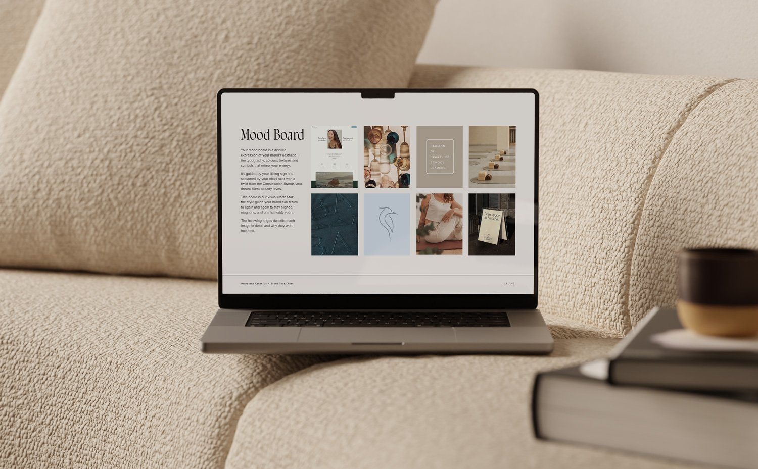
1. Prioritize examples of marketing collateral
Beautiful lifestyle photos are nice, but they don’t tell your designer what you want your logo, website, business cards, etc. to look like. So make sure your mood board includes examples of:
Typography
Layouts
Textures
Patterns
Print techniques
These are the building blocks of your brand, and they’re what your designer needs to create a brand identity that bring your vision to life.
2. Be strategic with colour
Creating a strategic brand colour palette is as fun as it is tricky. To get started we fully encourage you to go wild on Pinterest, using search terms that convey how you want your brand to feel (e.g., grounded, luxurious, muted, feminine). Then—and this is important—take a break.
With fresh eyes, you're going to scan through your board and notice which colours show up most often. Now it's time to be ruthless. Eliminate anything that doesn’t fit into this palette.
👉 Related reading: How to choose your brand colour palette based on your birth chart
3. Find a consistent graphic style
Whether it’s clean and geometric or soft and organic, pick one graphic style and stick to it. That means saying goodbye to any outliers that don’t align with the aesthetic you’ve chosen.
4. Be intentional with typography
Typography sets the tone for your brand. When selecting fonts, consider how you want your typographic system to feel:
Luxurious and elegant? Look for classic serifs or calligraphy-inspired scripts.
Laid-back and friendly? Go for rounded sans-serifs, slab serifs, or handmade lettering.
Bold and modern? Try clean, geometric sans-serifs paired with high-contrast serifs.
Typography is more than letters. It’s the visual expression of your messaging.
5. Consider print techniques
If you plan to create physical materials like business cards or packaging, pin inspiration for printing techniques. Details like letterpress, metallic foils, embossing, or die cuts can add depth and luxury to your brand.
Bonus tip: Weave in your astrology
Want to know how to make a mood board feel totally unique to you? Align it with your birth chart. Nothing makes a brand more special than attuning it to your unique astrological blueprint.
Learn more about the astrology-informed Moonstone Method™ of branding